A Working Concept
Rassle Master is a case study and work in progress. Rassle Master is an arcade style wrestling game with power ups and upgrades via trading cards. I wanted to document the process and this project will evolve as game development continues. Right now, characters and images are placeholder, only to give the vibes of what is possible. Once the art style and game mechanics of the game is developed, the UI look will change to meet the overall feeling of the game.
All of the elements design and layout are derived from previous experience in video game development, and experiences as a player. For example, the Player profile card, promo cards for news or promotional events, currencies, player ranking, etc. I love fighting games, shooters and othe ronline experiences and put a lot of those experiences in what looks like a simple interface.
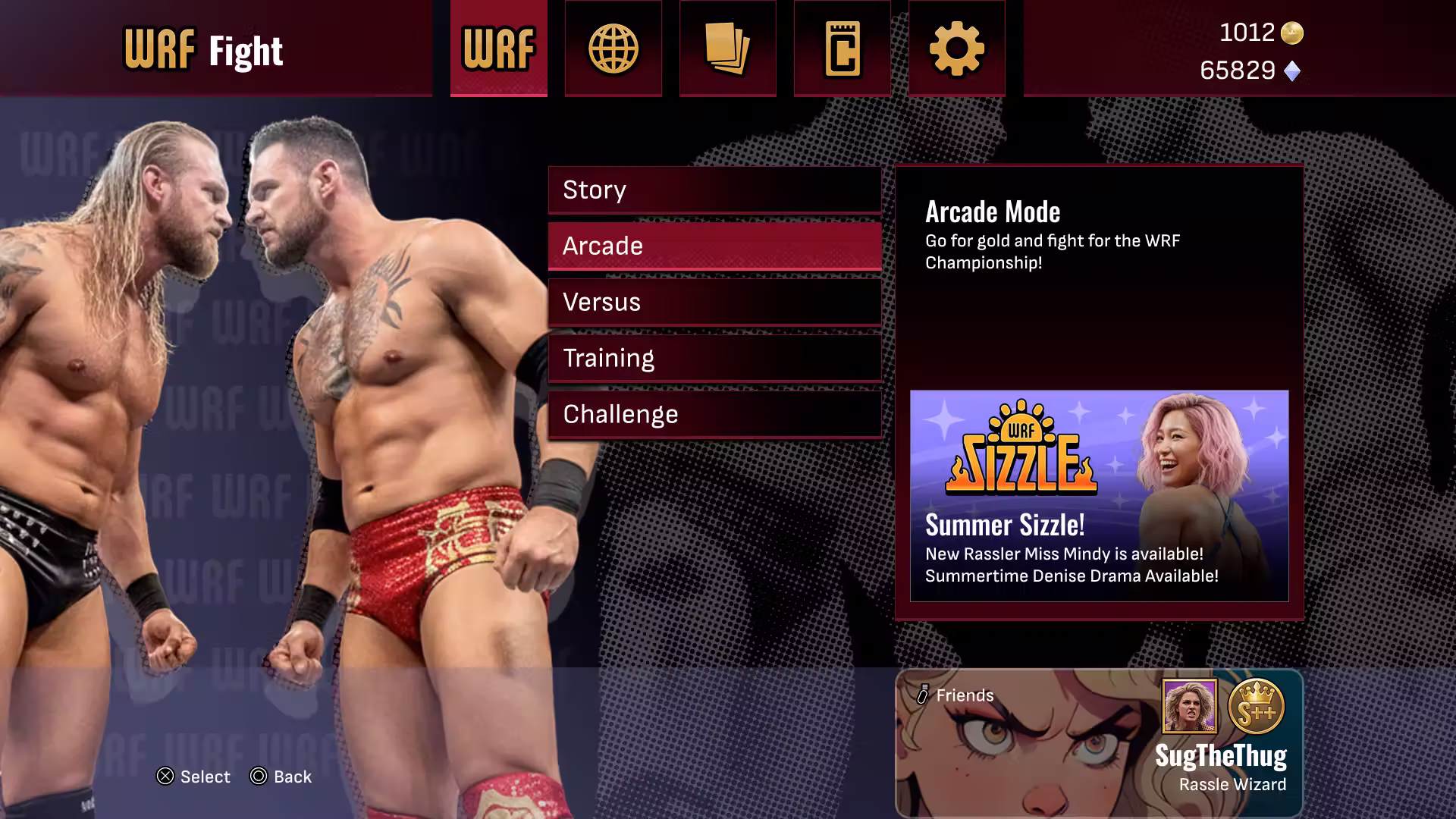
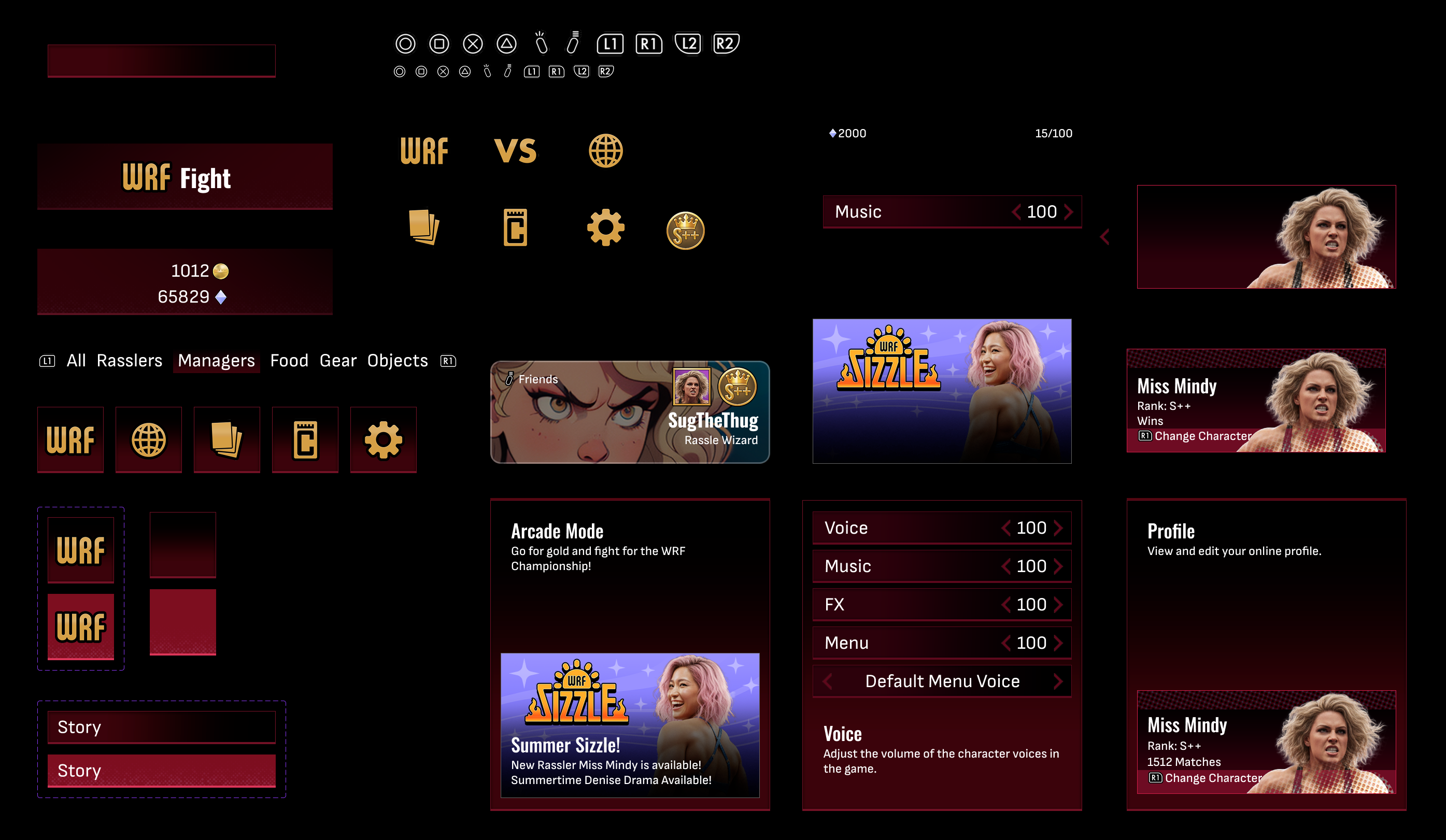
This is the base design for tabs and would fit allof the screens that could appear in this hub.
First Steps
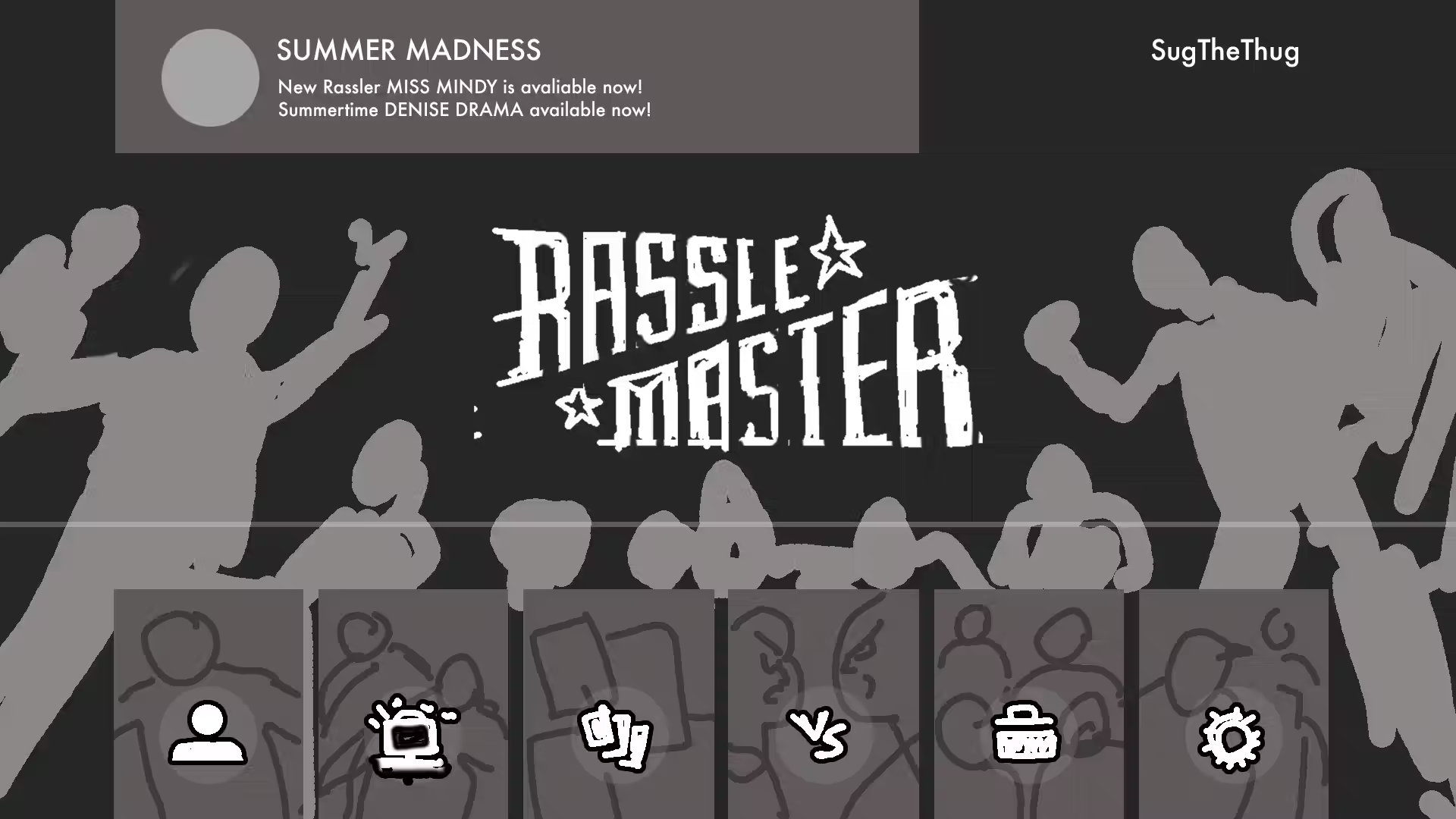
I wanted to get a clean layout across multiple screens. Graphics mainly based off of 80/90s wrestling magazines. This first step is more anticipation for what is needed to complete the project, what problems might rise, and make the broad strokes for design and flow.
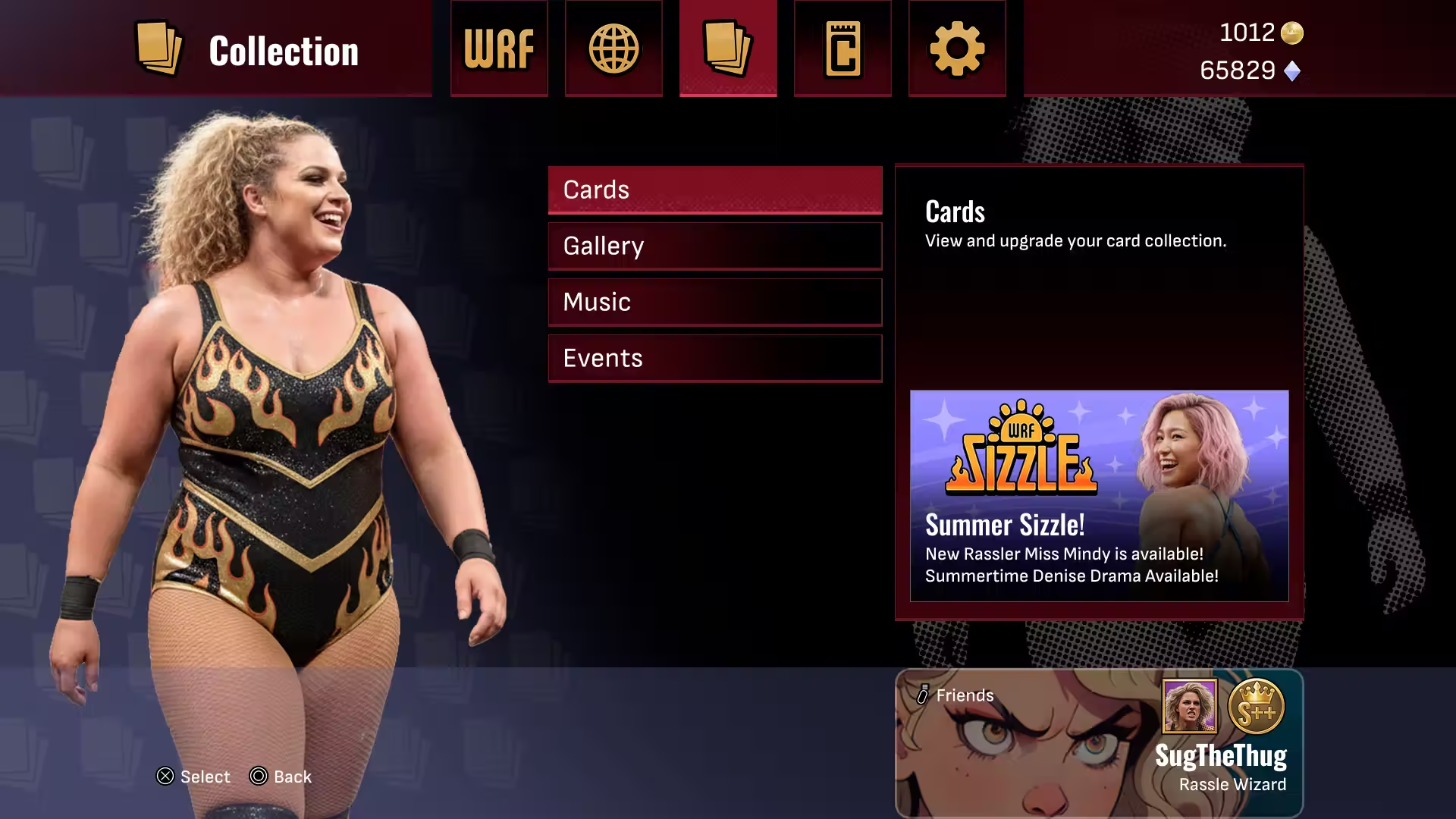
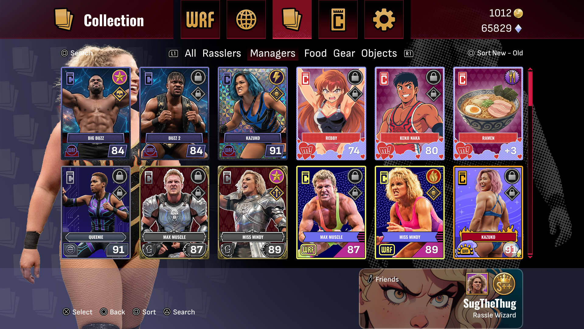
The Main hub is where I had to fit, a single player, online, card collection, store and settings menus. Also make a player profile card and currencies fit on every layout.
.avif)
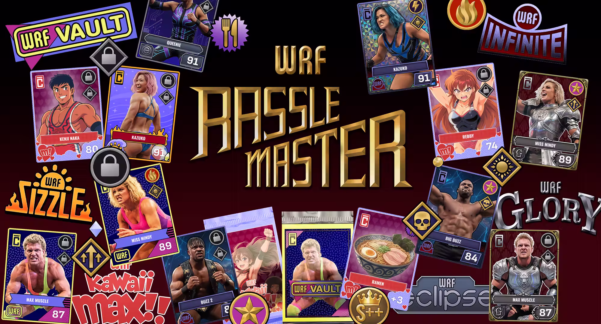
Card Design
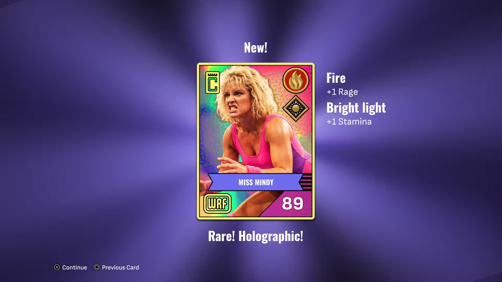
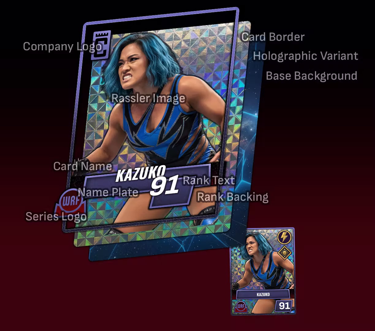
The card design was fun and had some twists I did not expect. For example, I enjoyed adding an in game Card manufacturer, a wrestling league, and logos for all of the different card series. I had to enter the world of trading card games, and see what made cards stand out. All seem. to follow very similar patterns and it was hard to break free from a lot of noisy designs. I guess overall it fits a physical card design, but in an enclosed game, they do feel over designed. I had to strike a balance of keeping a decent amount of flavor in the design and not going overboard. Also keeping in min, upgrades or other icons that can appear on any given card.
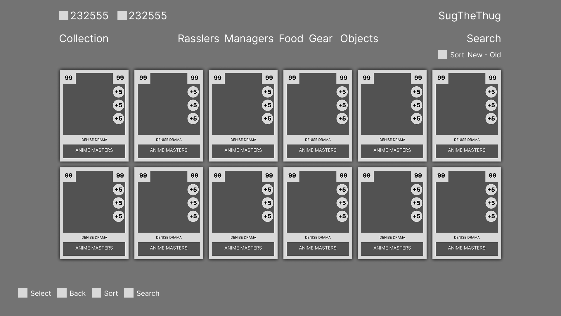
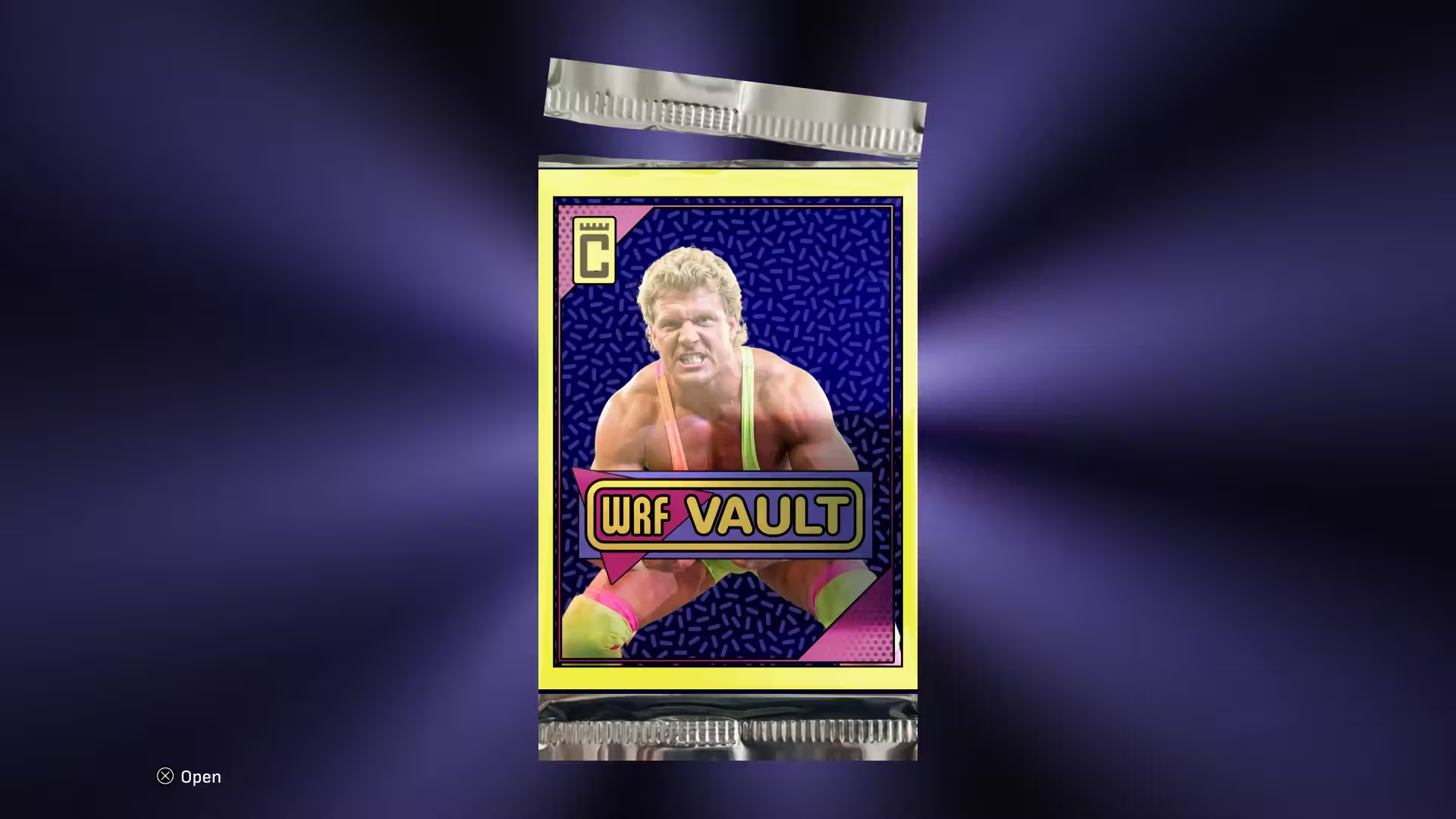
Card Series and Boxes
I had to brand everything like this was from a card manufacturing company and wrestling league. It was fun trying to come up with different skins but still make everything still fit within the game in an overall style.

Adaptable
All of the designs could be reskinned and rearranged to fit a new style direction. In the past, games I have worked on pivoted where the look had to change, whether its movie related or the art direction changed. My main focus is to make sure the layout is solid. Placement of buttons and text is important whereas the way items look including sizing can change in order to make sure it feels great. I feel like once I make the final assets for this project, the look will change quite a bit, but not necessarily the layout.
Ongoing
Started in late 2025, I want to continue to document this games' development. I think the next steps will be early animations and in game menus, and a skeleton for thin game screens. After that, make the next pass on all previous screens.